Information Design
Translate complicated data and content into digestible overviews and maps.
What is information design?
It’s the visual expression of your research and data.
Knowledge is power, but it can be obscured by boring slides with endless bullet-points, dense jargon, an array of opinions, stylised metaphors, decorative embellishments, or unhelpful default settings for graphs and charts.
Our information design service will help explain and present your information and data (quantitative and qualitative) in a way that’s transparent, honest, and simple to comprehend.
I’m fascinated by the psychology of perception, cognitive biases, and how clearly presented information can empower and motivate people.
It’s easier to innovate when we understand the facts. I care about keeping it simple, but not simplistic.


Infographics and Technical Concepts
An infographic is a collection of images or charts (with minimal text) that gives an understandable overview of a topic—quickly and clearly.
The goal and challenge of presenting complicated concepts is—the data needs to be understood in a holistic way. All the parts need to combine to make a whole.
The purpose of information design is to connect the dots so people can wrap their minds around big things without feeling confused or overwhelmed.


Presenting Quantities Over Space & Time
Whether your data is maps, diagrams, charts, graphs, trend lines, or tables—you are building a presentation that requires attention to detail but also a unified feel. Transform what are normally standard sets of data into rich, impactful pieces. Your graphics will be styled according to your report details and be consistent with your brand.


Frameworks & Diagrams
I can create sets of related information pieces that efficiently tee up operations for project builds, company or product transitions, or interesting ‘scrollytelling’ brand stories.
Your infographic and accompanying assets will be branded to align with your overarching goal or campaign. Your suite of deliverables can be edited by your team in Adobe Illustrator, or we can create versions in PowerPoint or Keynote.


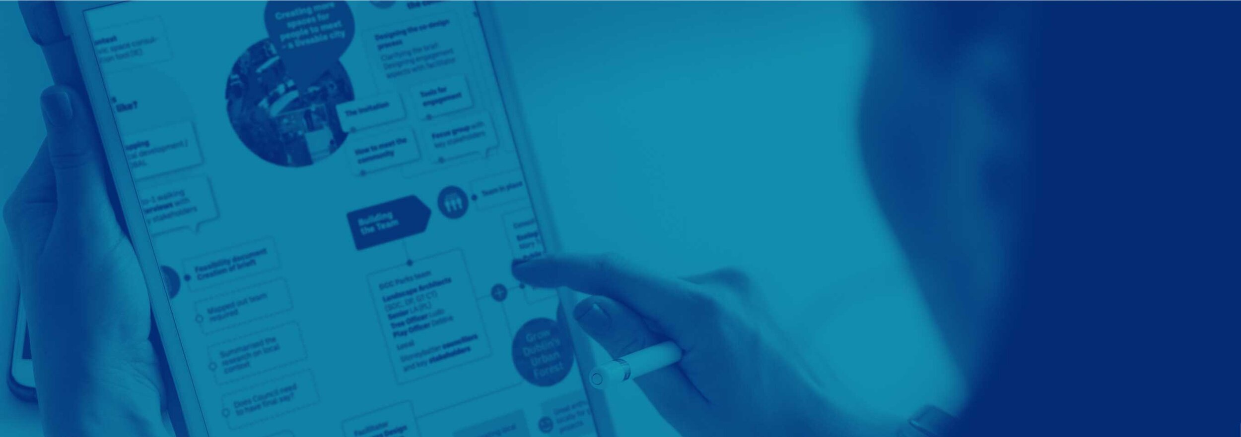
Qualitative Research & Journey Maps
Research that includes a series of interviews, focus groups, observation, or literature review can be represented through the lens of people in ways that are organized for visual efficiency.
Flow charts
Experience timelines
Scenarios
Patient or customer journey maps
Your graphic can be presented as large wall maps, presentations, or interactive PDFs.

Personas & Customer Profiles
For many innovation projects, representing a typical user or persona can support the development cycle or presentations to investors. Photographs can sometimes be too specific. We can illustrate your users as a consistent visual set in a lively way with diversity in mind. Receive a suite of re-usable images that are cohesive with your brand.


Collaborative Mapping—On & Offline
Plan a group working session with goals in mind. We can create a family of templates and processes to capture ideation and brainstorming. Frameworks such as maps and canvases in Zoom, Mural, Miro, or on office walls are another possibility. It’s easy to pull across the input of text, drawings, and marks into digestible reports that can be used to share and gather feedback.


Explainers & How-To’s
We can help break down the steps of your product or service and translate them into instructions or easy-to-follow explanations. A scenario can be annotated by drawing the scene and adding labels that bring the details to life.
We are flexible whether you’d prefer a style that’s illustrative or technical
As an option, we can turn your explainer into a whiteboard animation.
What information design is not:
I won’t take a long report and magically condense it into a short summary. We’ll work together—prioritising the information, pulling out a story, identifying a hierarchy, and defining meaning before I put pen to paper or stylus to iPad.
We’ll do this through a session or series of consulting sessions. We may also choose to include a team meeting. After your report has been delivered for your review, we’ll get together again (either in-person or virtually) to review and discuss adjustments.
Your deliverable could take a few different forms including a PowerPoint, wall graphic, booklet to circulate, video, or workshop.
Benefits of information design:
Enhanced understanding and comprehension for the reader
Makes sense of data through the strategic organisation of content
Helps the reader connect with and care about the information
Simplifies the presentation of information with specific users in mind
Removes noise and complication from the communication process
Eliminates wordy reports and boring spreadsheets
What you get:
A series of images (web ready or print quality) that work together in a presentation sequence
Interactive options that fit your needs such as whiteboard templates for your team to share and use, interactive PDFs or Prezi, explainer animations, murals, frameworks, maps, and more.
Editable templates (if desired)
Training (if desired)
Liaison with your developers or tech team (if desired)
How it works
We’ll start with a 30-minute free consultation so I can assess your project and create a project scope and quote. Many times there are one or more virtual consultation sessions needed in order to thoroughly review the information for your design. I’ll sketch some preliminary concepts for your review. Once that is approved, there will be an estimate provided for design studio time. I am more than happy to work with your content specialists, copywriters, researchers, L&D team, tech team, UX/UI specialists and social media team.

